
Expanding on last week’s post about changing focus on my creative outlets, I’ve been thinking about why this decision has been resonating with me so much lately.
I could say that, like any other author, I feel like sometimes I don’t quite get my point across with my writing. I get close, but I don’t quite nail the landing, and it bothers me when it happens. It feels like I phoned it in just to get the damn thing finished. I know I’ve felt that way with pretty much all my stories to some extent. Still, that’s no reason for me to give up on writing, even temporarily. It’s got to be more than that.
Perhaps it’s that I’ve been using written words to express myself for so long, that I’m better at writing it out than I am trying to speak it sometimes. I trip over my words all the time, have linguistic brain-farts and forget what point I was trying to make, and get easily sidetracked if someone interrupts me. [This makes a lot of sense, as I always feel a sense of deep irritation when that last one happens.] Ask me to write something out for you, however? I’ll write you goddamn piece of art. Heh.
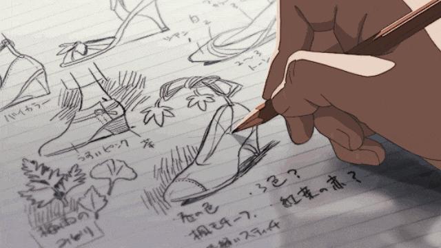
And all this got me thinking about how I used to express myself with music and art, especially in the early 90s during my college days. I was full of song ideas and comic drawings that spilled out into my notebooks, often as that ‘secondary focus’ while I was in class. It’s where I wrote some of my best lyrics for The Flying Bohemians and drew nearly all of my Murph strips and drawings. Both of those projects weren’t just doodles, either; I had some detailed plans for both the music and the comic, and the only reason I never followed through on either one was because I felt I’d started too late and didn’t stand a chance to catch up with most of my more creative classmates. To them I was just some idiot who wasn’t alternative enough and wanted to jump on the bandwagon. Or at least that’s how I felt they saw me, at any rate.
But here I am, years later and knowing a hell of a lot better. I’ve achieved my writing goals multiple times over the last ten years, and I’m pretty damn proud of that. And more importantly, that my age and the level I start at doesn’t mean jack shit. It’s that I do it at all.
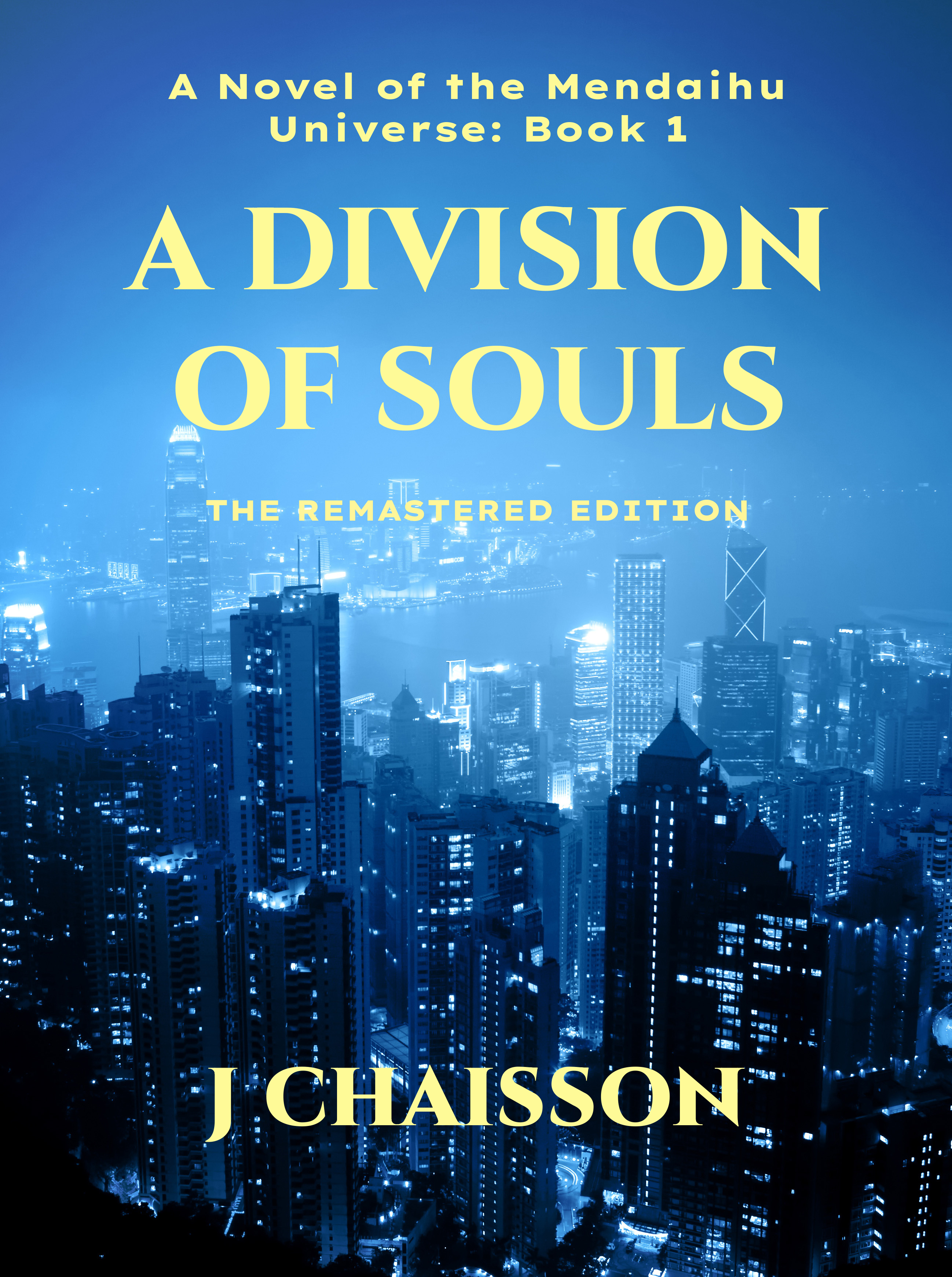
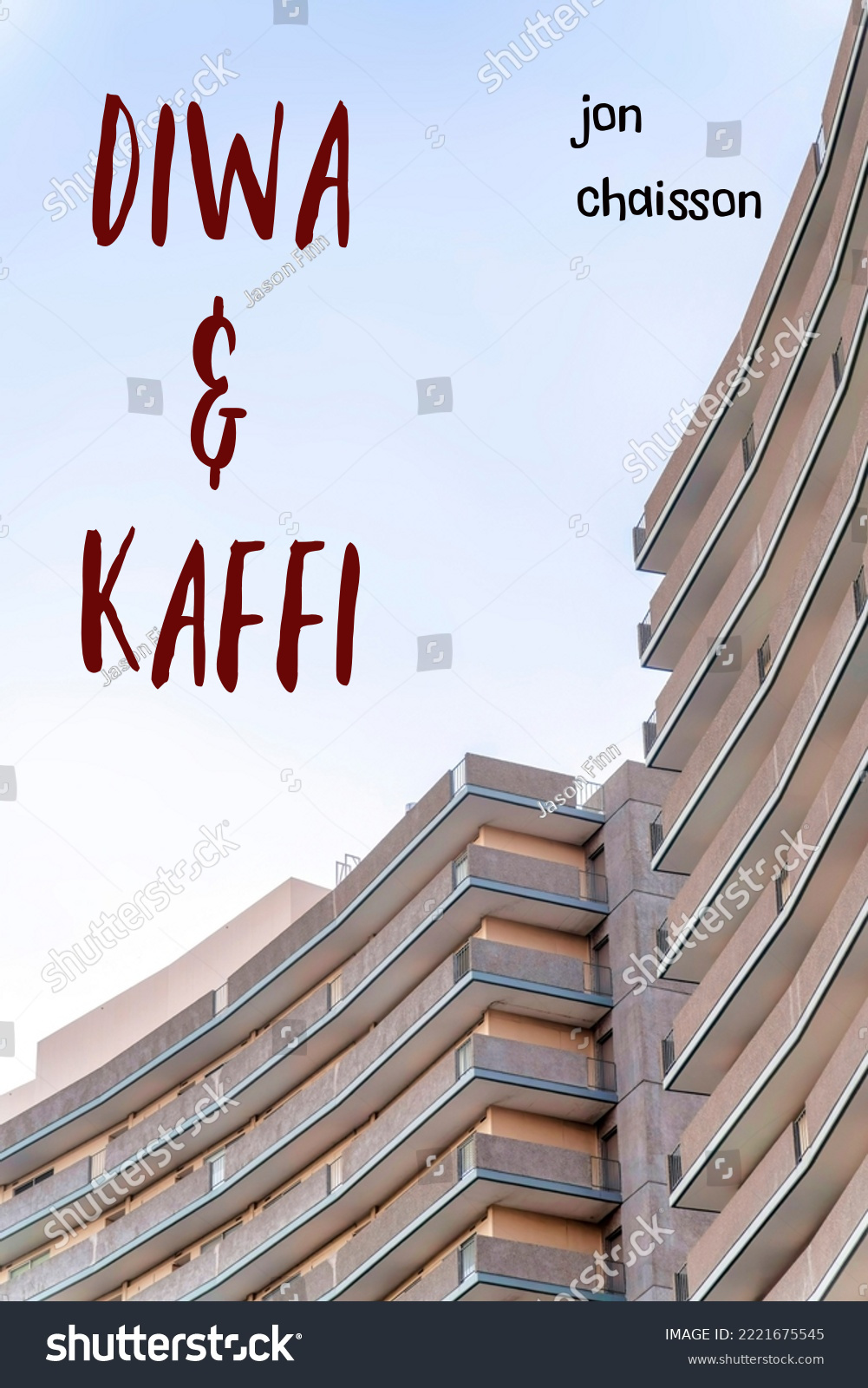
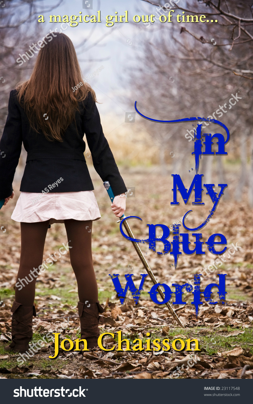
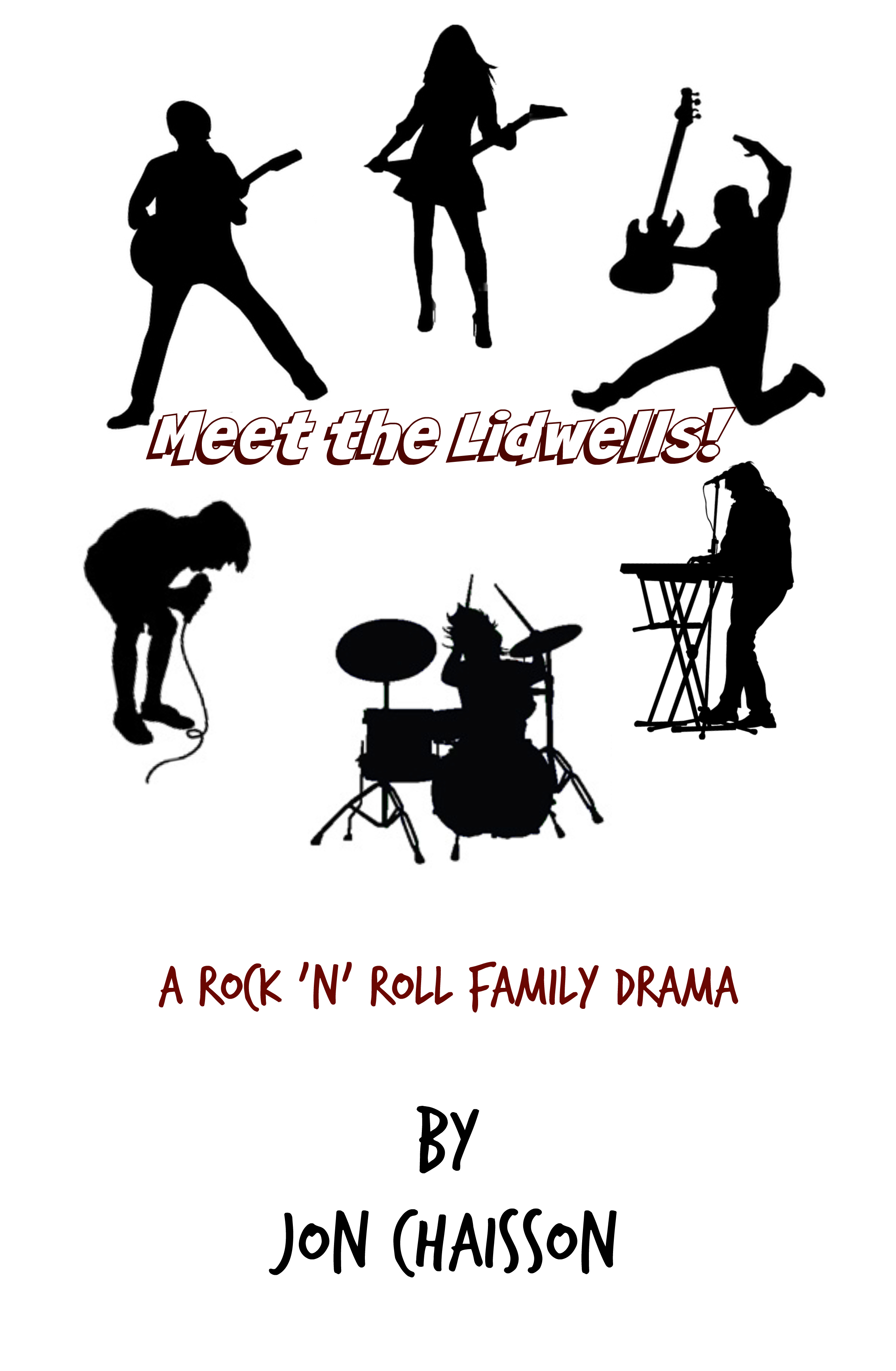
I think I started realizing that some years ago when I bought myself an higher-end yet affordable digital camera and started experimenting, and realized it again when I started doing my own book covers. I’d taken a lot of pictures with my phones, sure, but there was something about playing with this visual medium that intrigued me. Even if it was taking simple pictures then processing them through things like PicMonkey and Affinity — always kinda-sorta knowing what I was doing, but leaning heavily on creative instinct — this outlet resonated with me. I’m only slightly annoyed that I let that one fall by the wayside for a while as well.
This is why I’ve been thinking — why not revisit these outlets? Pick up where I left off? See what comes of them?
Perhaps it’s time to discover a new way of expressing my creativity.