Creating Covers

So tonight I decided to play around a bit with the cover for The Balance of Light, even though it’s still quite some time before it’s going to see ebook or print.  This one was tough, because I had an idea of what I wanted, but looking for the right picture was going to be a tough one.  I wanted something to balance out the blue/yellow night view of A Division of Souls, so I knew it would have to be yellow/blue and morning.  I had the color scheme down, but the picture was the tough part.

I’ve said before that I really love this part of the self-publishing process; I mean, really love it.  Like, to the point that I may possibly do this as a side-job in the future.  I love looking for that perfect shot.  Trying to get the perfect crop balance.  Figuring out whether to adjust the color or give it a bit of an effect.  Playing around with fonts and text placement.

I’ll be honest, it’s like I’m making fake album covers.  It’s something I used to do as a teenager with my mixtapes and the Flying Bohemians tapes.

Let’s take a quick look at the three covers I’ve made so far:

ados 100615 nt cover

The cover for A Division of Souls was meant to invoke a few things:  the setting (a metropolis, teeming with people), the time (at night), and mood (tense and mysterious).  It’s also to serve as a tie-in to the very first scene.  In short, my aim was to say: this is what the book’s going to make you feel.

The cover was also supposed to tie in with the other two books, which means that I also had to think ahead:  what were the other two going to look like?  I knew I’d have to keep a few visual motifs going…a city would have to be involved in all three, somehow; the images would need to evolve, just like the story itself.  In this case, I created multiple ‘lightboxes’ in my Shutterstock account and started looking for pictures that would do exactly what I needed them to do.

The time it took to throw this one together was surprisingly quick, to be honest.  Looking at it now, I can see a few things I should fix, but for the most part it went smoothly, once I knew exactly what I wanted to do.

tpom 032316 take 2

The cover for The Persistence of Memories was a bit trickier, and I think it looks better as an e-book cover than it does as a trade paperback cover, but I do like how it came out.  The same rules applied here…in this case the setting was twofold: it takes place both on Earth and on Trisanda, so I chose to do a ‘satellite’ point of view that shows both the city below and the stars above.  Time seems to be fluid in this shot.  It seems to be late night in the city below, blanketed by the similar blue (not exactly the same but close) of the first book, but in the heavens, time is irrelevant; it’s all light and dark at the same time.  It also creates a dreamlike mood, where you’re not entirely sure what’s reality and what isn’t.

The placement of the title was purely serendipity, to be honest; I did not expect the top two words to be in space and the bottom two to be in the planet’s atmosphere.  It just turned out that way and worked out quite nicely.  Funnily enough, once I’d noticed that, I was torn on exactly where I should place it…the other outtake had the title dropped a tiny bit lower, so the “of” is resting right on top of the gray cloud line instead of hovering over it like it is.


I haven’t made a solid decision yet on what the Book 3 cover will look like but this is what I came up with tonight:

tbol outtake 3b


I’m still playing around with the font color for the title, as well as the placement of the text.  The picture hints at the metropolis of ADoS, but the mood and the time is different: we’ve gotten through the late night of Book 1 and the witching hours of Book 2, and now we’ve come to the morning after of Book 3.  The yellow of the sunlight is supposed to hint at the yellow font of Book 1, and I’m still trying to figure out which bluish hue would be good for the title (to hint at the blue cityscape of ADoS).

True, it does kind of hint at new-agey books, but that’s kind of the point…the characters and the planet itself has gone through a spiritual awakening of sorts.  And like Book 2, it serves a dual purpose: the physical awakening from that dreamlike state, and the spiritual awakening.

*

One thing I learned early during this process was that I shouldn’t merely look for something that ‘looks cool’, no matter how tempting it may be.  The last thing I needed was to look for something shiny, because I didn’t want the casual viewer to say ‘wow, what a flashy cover’ but not completely connect with it or remember it.  I wanted something unique.  Something that stood out from other covers, not because it was the flashiest, but because it was different. Something to catch their attention because it stood out just enough.

These first three are my first attempts at doing book covers, and as you’ve probably noticed, there are no actual people on the cover.  This was a conscious choice; not only is it because of the large cast, but because I also wanted to invoke the idea that it wasn’t just my characters being affected by the story, but planet itself.

My next couple of projects do involve a much smaller cast, so there’s a very good chance I may use people (or silhouettes) on their covers.  I did a brief Shutterstock search for those and found a few ideas to work with, and I’m looking forward to these when I get to that point.  The main drafts of these stories haven’t even been written yet, or at least not completely, so again this was a bit like creating fake album covers!  In the process it’s giving me something fun to look forward to.


On Writing: Entr’acte

doot doot doot...
doot doot doot…

I’ve said it before, I’ll say it again.  When a writer purposely decides to take time off and not write, it definitely feels weird.  On the one hand you’re enjoying some mental time off, watching movies or catching up on tv shows, or reading that book you put aside a few months previous, or maybe even just goofing off on the internet for hours at a time.  On the other hand, you’re itching to get back to work as soon as possible and work on that next project.

So what have I been doing all week?  I mean, aside from goofing off on the internets?

A lot of offline stuff, really.  Cleaning the apartment.  Doing some shopping.  Practicing a bit of guitar playing.  Continuing on my daily personal journal.  In short, living life outside the Next Book.  I even skipped out on updating this blog.  Okay, I may have browsed over at Shutterstock to decide on my next cover, but no real work was done.  I purposely gave myself a week off to unwind from that crazy five-week blitz of line editing and doing all the backstage work for A Division of Souls, before I jumped in on the probably-longer blitz of line editing and backstage work for The Persistence of Memories.  [And there’s also the fact that I will need to continue paying attention to the release of ADoS so I can figure out various ways to promote it.]

It’s not to say I never take an evening off…I definitely have, here and there.  A day where I’m feeling under the weather, or just had a shitty day at the Day Job, or whatever.  I’m not chained to the writing, I’ve just turned it into a healthy addiction.  When I first wrote TPoM back in 2002-3, I was dedicating two hours daily (including weekends, when I’d dedicate more) to writing at least a thousand pages a day.  The words just flowed, I was in a good frame of mind, and I wasn’t about to let that pass me by.  But I did take a few days off here and there, either to sickness or personal plans, or just plain wanting to take a day off and read comics instead.  Sure, it felt odd, but I wasn’t feeling guilty about it.

That said…I’m going to be jumping back into the fire tomorrow.  TPoM is nagging at me to be edited (this current version clocks in at 180k words, so I’m sure there’s going to be some serious deletion going on).  Added to the ADoS promotion, the cover art, this blog, the Day Job, and maybe even other non-Mendaihu Universe related writing work, I’m going to be a busy little worker bee for the next few months.

Wish me luck!

Adventures in Self-Publishing: Cover Art

Almost-official cover, take two.

Today’s work included taking the step of buying a stock photo and finally utilizing my sort of decent art skills for future profit. I used the most basic plan on Shutterstock: $41 for five downloads, four of which I’ll use at a later time for the other two books in the trilogy, and maybe a future project or two.  That was the easy part.

The hard part was thinking three or four steps ahead before I even started. There are a few things that I had to keep in mind before I went anywhere with this.

Image Resolution. Many places like Smashwords and BookBaby require high resolution of the finished product. This is so your potential readers will see a nice clear picture on their e-reader, and won’t cause pixelation (i.e., it won’t look all blotchy and fuzzy if you blow up the picture larger than necessary).  Thus I downloaded the highest resolution, which I believe was 3400 x 3400 pixels. Much higher than necessary, but after cropping, it still looks good.

Cropping ratio.  This is something that is actually pretty important yet not too many people think about.  The most common ratio for e-book covers, I’ve read, is 1:1.33.  That is, 1.33 times taller than it is wide.  And looking at this cover take, that makes sense, because it’s roughly the same shape as most tablet and e-reader screens.  I admit I went a bit lo-fi here to figure it out:  I took a ruler and measured the picture on the screen.  In the above thumbnail here, it’s 2.5″ wide.  If you multiply that by 1.33, you’ll get 3.325″, which is very close to the height I ended with.

Fonts: color and placement.  I have to thank album covers for being able to understand this one.  For my example, the most important part of the cover, aside from the visual, is the title, right?  So in this version, instead of bannering it up on top like the previous attempt, I chose to spread it down the entire center.  The font had to be larger than the other two lines I’d be adding (the subtitle and my name).  BUT — it also had to stand out.  In this case, I asked for assistance from one of my artist friends: since I knew I’d be using this photo and that its primary color was blue, what is the opposite of blue?  [This is actually pretty easy to figure out: here’s a color wheel chart you should save for reference!]  In this case, it’s yellow, so I used a very light shade of it for the title, to make it stand out, even more than the subtitle or my name (both in standard white).  The fonts themselves were provided on the free version of PicMonkey.com…the title is Geo Sans Light and the other two are De Walpergen Pica.  All three were placed with a bit of ingenuity:  I aligned the sides of the text blocks with the sides of the picture, and had everything center-aligned.

Clarity.  My original outtake in the previous post used the Edo font on PicMonkey, but here my wife suggested a different, plainer font.  It’s a bit unexpected to be sure, because it doesn’t look like a genre font.  It’s classic and plain, but it still looks professional.  The trick here was to ensure that none of the words vanished in the white spots of the picture behind it; yellow stands out well against blue, but gets lost against white.  Everything is readable, and that’s the most important part.

Viewing it in different sizes.  This is another thing that sometimes gets glossed over or forgotten, but it’s actually quite important, and ties in with everything else.  Think of it this way — say you’re looking for that new book you know has just come out, but you need to scan the New Release shelves and the endcaps in order to do it.  Chances are when you see it, you’ll be at least a good ten or twenty feet away.  Same goes with e-books: when you’re browsing online, you’re not looking at the actual-size cover, you’re looking at a thumbnail cover.  This is another reason I downloaded the high-res version: the picture itself doesn’t look too sketchy, but more importantly, the fonts are still readable.  It’s okay if the subtitle is fuzzy; it’s not important.  What is important is the title and my name, so I had to make sure they were large enough to be read.  This is why I’d tweeted it right after I’d completed it:  I wanted to take a look at it on my phone, to see how it looked on a much smaller screen, plus I’d get feedback from my friends as well.

*

Granted, I already own Photoshop (a birthday present from a few years back), and I’m kind of lucky that I have a lifelong interest in art and a passable ability for it, so I’m able to do most of this myself, which is exactly what I wanted to do.  Some of you may want to hire out a professional cover artist instead.  There are many out there — The Creative Penn has some good links to a few out there, for instance.  And many of them are quite affordable.

In the end, the cover still remains one of the most important parts of the book (or e-book), because it’s the first thing every reader sees.  You can let the pros take control of the cover creation, and all you’ll need to do is explain the images you’d like to see.  But if you have the ability and want to go it alone, definitely keep the above in mind.  Don’t just throw something together and call it done, either; just like musicians, save a small handful of differing takes and use the one that works best.

On Covers: And now for something fun…

Credit: http://all-that-is-interesting.com/fog-over-dubai
Credit: Daniel Cheong Photography.  Source: http://all-that-is-interesting.com/fog-over-dubai

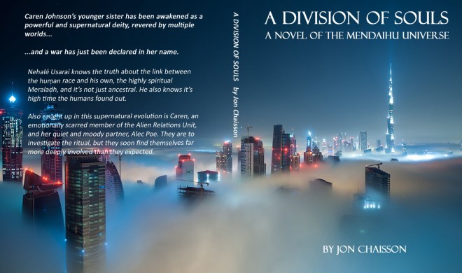
Thought I’d have a little fun with Photoshop and a picture found via Google that pretty much fits the feel of A Division of Souls, and created a quick mock-up cover for it. All told it took me just over an hour, a bit of cropping, playing around with fonts, and rewording the back cover copy from previous query synopses I’d written. Tell me what you think! Note: If you’re curious, that’s Dubai. I picture the Mirades Tower being very similar to the Burj Khalifa. Note: Yeah, I know the copy on the back cover gets a bit screwy when white letters overlap shiny blue lights of that skyscraper. Like I said, this is just a mockup. 🙂

EDIT: I finally just recently discovered that this picture was most likely taken by Dubai resident Daniel Cheong, so proper credit where credit’s due.  Check his stuff out at Daniel Cheong Photography, it’s well worth it.