Reading and Publishing

I really need to get myself back in the habit of reading more genre fiction again. I mean, not that I’ve been wasting my time at night — my music bio backlog is considerably smaller now — but I’m thinking that I really need to start reading more SF/F. I’ve been kind of avoiding it over the past few years, to be honest. I didn’t plan on it, it just happened that way. I don’t think it’s negatively impacted my genre writing to any serious degree, but it wouldn’t hurt to return to the source again.

One thing I’ve been meaning to do for a while is read more ebooks, and in particular, more indie publications. The other day I decided I was finally going to make good on that by downloading titles from B&N and elsewhere. Most of these are quite cheap and, like my Bridgetown Trilogy, the first book in a series is often free!

You know what I also haven’t done in ages? Self-publishing! I’ve been thinking about it a lot this past year, since I’ve been focused on submitting Diwa & Kaffi. I truly do miss the DIY aspect of it — creating covers, toying with photo editing software, making postcard freebies, and all that — and I’d love to return to that. I’m thinking in 2021 I may in fact do so, especially if I can get one or two of my stories prepped and ready to go. I especially would love to take my photography a lot more seriously again. I do have a creator’s account with Shutterstock that’s currently not doing anything, so perhaps it’s high time I reactivate that as well.

I suppose these two things could be the start of my New Year’s Plans. Sure, why not? I mean, I can start working on a lot of this whenever I like; no reason I actually need to wait until the first of January. [In fact, the other day I jumpstarted the ebook buying and spent $6 on four books and one book bundle!] I have most of what I need to make it all happen, so all I need to do is take the next steps.

Let’s make this happen. Pandemic or not, time to make it all happen.

On Self-Publishing: Creating Book Covers

050418 shutterstock outtake 1
Picture credit: Shutterstock/Jose AS Reyes.

I’ve said it before, I love doing covers for my books.  It’s another creative avenue that I get to play around in that I don’t otherwise have much time for.   Every now and again I’ll go through my own pictures and create one just for practice.  [I’ve even come up with a few pseudonyms for certain styles; for instance, all my fake mystery novels are all written by Chase Johnson, and my fake lit-fic and women’s fiction is by Joanna Chase.  Why? Because it’s fun!]

I’m still sticking with the above image for In My Blue World, so if I’m going to use it, all I need to do is purchase the rights from Shutterstock, fiddle around with it a bit, slap the title and by-line on it, and call it done.  I still use Adobe Photoshop to crop it to the right size and adjust the image.  (I’m probably going to lighten it a bit so the title and by-line will pop out more.)  And I still use the PicMonkey website for the text.  Sometimes it takes a short amount of time, sometimes it’ll take a few days before I get it to how I like it.

One thing I’ve learned from doing covers — aside from enjoying the process immensely — is that I should always make sure the cover ties in with the novel in a specific and important way.  It’s not enough to get a badass lady with a katana on the cover…there has to be a reason for it.  In this case, I chose this cover for a few reasons:

–The first half of the novel takes place in forest land.
–I didn’t want the girl to be in an Attack Mode pose, but an I’m Ready for This pose.
–I didn’t want her clothes to be stereotypically frilly or flashy (or steampunk or goth, for that matter).
–I wanted there to be at least some hint of blue sky in the background.
–It needed to have a decent amount of space for the title; in this particular instance, I like how the text not only balances it out, it intermingles with it.

This is also why I used the cover for Meet the Lidwells! that I did; it was a straightforward concert poster-stapled-to-lightpost image that is pretty much universal for any band starting out.  They say that the cover often pre-sells the book, especially if it’s eye-catching enough from across the sales floor (or legible in thumbnail online, for that matter).  Don’t think of that as needing a flashy action shot, or a crafty written-in-chalk image.  Look at other covers you thought were innovative or creative.  Look at the ones that made you stop and pay attention to it; then look at the cover as you would a piece of art…why did it make you stop?  And how can you use that on your own covers?

Just like my writing, my cover art has changed and evolved and advanced, little by little.  The more I practice, the more fake covers I make, the bigger my portfolio that I can use later on if I so choose.  And I would like to expand on it as well; for the Apartment Complex story I’m thinking about commissioning an artist — specifically a webcomic artist.  I already have a few images in my head that could work.  I’d still do the text, but I’d like a unique image this time out.

I know there’s a lot of self-publishing advice out there stating that you should never do your own cover, but I’d probably amend that: don’t do it if you don’t want to do it, or if you don’t have the ability.  On the other hand, if you have the artistic chops?  Go for it!  It’s a hell of a lot of fun and you can get really creative with it.

Planning Ahead

tenor
I’m usually not this bad, folks.

I know it’s only mid-June, but I’m already thinking two months ahead to August, specifically Worldcon weekend.  [Okay, I’m also thinking about our week-and-a-half vacation to London just before it, and about how I’ll be a walking zombie by the time the con is over, but that’s another blog entry altogether.]

At present, I can safely say that I’m nearing the climax to In My Blue World.  If I time this right, I should have this draft done by the end of June, leaving me the entirety of July to revise it and ready it for self-publication.  I may or may not have it ready in time for the con, but I’m not too worried about it.  If I’m successful, I may be able to snag a reading panel then to read from it.

I’ve done this for pretty much all my books so far…once I know I’m nearing the end of the first draft, that’s time for me to start working on the post-production things.  I’ll start playing around with book cover images.  I’ll start thinking about promotion items and platforms.  Working out the final release schedule.  Those sorts of fiddly things.

I work on those things very early on and in a piecemeal fashion so I’m not crushed under the weight of doing it all at once at the end.  It’s also so I can give myself time to make final decisions or if I should go in a different direction.  And also, these fiddly things are often quite enjoyable to me when they’re not breathing down my neck!

As a self-published writer, I find that I often have to plan out my post-production work in very much the same way I plan out my novels.  I need to think about the overall plot and how each scene and sequence fits together to form the whole.  Or in this case, plan out where I’m going to be when, and what needs to be done to make it all happen.  There’s a lot of multitasking going on, but if I spread it out a bit, I can handle it.

My plan is to do a reading at the con, and if I don’t have the book available, I’ll at least have postcards to give away with the book cover image.  I’d like to have the book out into the wild by September, at least in e-book form.  [I’m also thinking of other platforms for physical copies, but that’s another long term project and another post entirely.]

So yes…even though I’m wrapping up another novel, I’m just getting started on the post-production, which should keep me busy for a few months longer.

*

And for those curious, here’s a very rough draft outtake for the cover of In My Blue World.  This is by no means the final cover, of course, but it’s along the lines of what I’m aiming for.

050418 shutterstock outtake 1

Getting it right and completing the work

your name taki erasing

As much as I would LOVE to release Meet the Lidwells! right now at this very moment, I’m still not entirely happy with a few things related to it.

The cover, for instance.  I’m still not happy with it. I’ve thought through a few layouts, played with a few in Photoshop, and I’m still not happy with it.  To be brutally honest, at the moment it looks like the original cover of Jonathan Franzen’s Purity, which I so mercilessly tore apart upon its release.  And the last thing I want to do is make it look like I’m saying …but hey, if *I* make a cover like that, it’s art!  Come on, Jonc. Face the facts.  That ain’t how it’ll work out.

Thankfully, during one of those nights where I’m lying in bed after lights out, thinking about my writing when I really should be trying to get to sleep, I realized where I was going wrong, and came up with an excellent alternative that I’m quite certain I can pull off.  Which means that sometime within the next week or so, I can start working on the improvements.

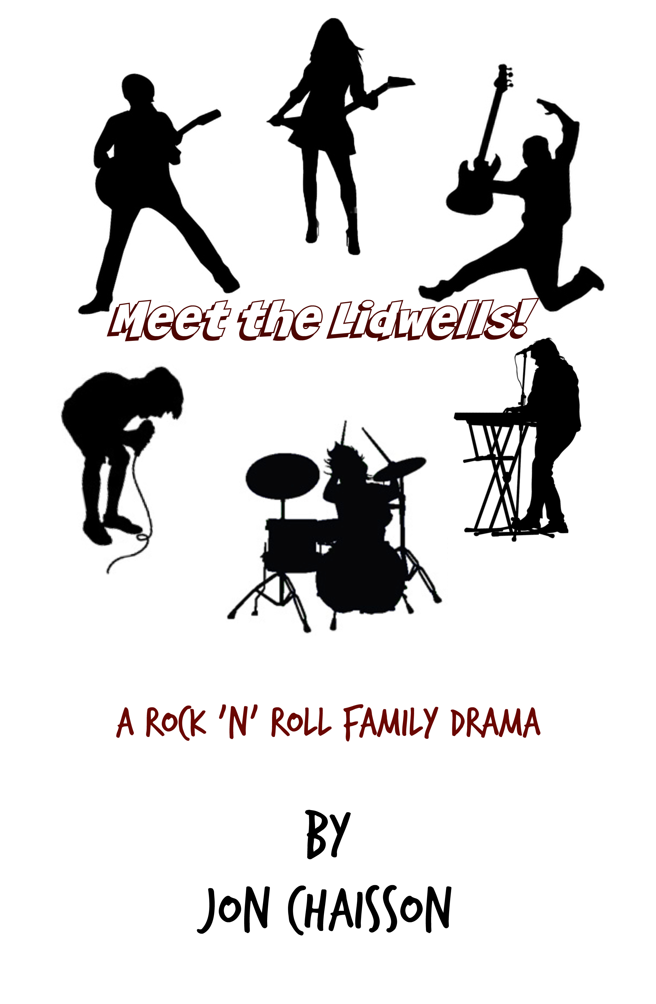
As you can see in this outtake I did a few months ago, my original idea had some merit, but it also looked like I threw it together in about five minutes.  It looked too sparse, too unfinished.  I need to do more with it, but I wasn’t sure what.  The piece that needed to stay was the image of the six silhouettes; it’s an important plot point in the first third of the book, as it’s the cover of their debut album.

The error I made was that someone looking at the cover without looking at the book wouldn’t know that.  I realized this was the same exact issue the original Purity cover had — I learned much later that the woman’s image is in reference to a passport photo.  Having never read the book, I would not have known that if someone hadn’t told me.

This meant that I had to figure out how to get the point across that these silhouettes are something important.  And that late evening, I realized that it didn’t have to be an album cover, per se.  In the book, that ‘iconic’ image of the Lidwell kids didn’t originate as their album cover, but as a flyer for their first shows.

Which gave me an altogether different canvas to work with.

SO!  This means that I have some more work to do in creating this cover, but I know exactly what I can do with it, and how.  And even better, I can once again pull it off on my own!  Self-publishing FTW!

*

I’m telling you all this, because this is how a writer, especially a self-publishing one, should think about their product.  There will definitely be times where you get stuck on certain parts of your project, where you can’t quite figure out how to fix it.  You’ll waste time trying all sorts of things that won’t work.  The temptation to say ‘screw it’ and call it done can be quite high sometimes.  Or worse, you’ll talk yourself into believing that your half-assed attempt will be understood by everyone else as a brilliant move.  You’ll be getting close to your self-imposed deadline, or even fly past it, and want to kludge something just to get it out there.  I’ve hit these roadblocks plenty of times.

Thankfully, my stubborn will kept me from taking that route.  As long as I kept telling myself there was a better way to do this and that I just had to figure it out, I was fine with releasing it a little later than usual.  All I had to do was work through this roadblock.  And I’m happy I finally did!

Meet the Lidwells: Cover Outtake

Meet the Lidwells Cover B

Keep in mind, yes — this is definitely an outtake.  Not that bad for a first try, though.  I know I’ve got some more work to do on it.  The main focus this time out was for me to figure out the placement of the six main characters and make it look like an album cover.  [In the story, this is actually what the cover of their debut record looks like.]  I have a slightly adjusted version of the six silhouettes so they’re spaced out a lot better and can provide the title as well.  I think I’m going to redo it by putting the image and main title enclosed in a square box to further push that image, and have the bottom segment in black, with the text in white.  I’m still playing around with the fonts as well.

[Keep in mind, I still have the last third of the book to write, but I’ve had this cover idea in my head almost from the beginning.  I’m still hoping to have this one out by late fall, depending on when it get finished and revised.]

What do you think? 🙂

Fly-by: We (maybe) have a cover!

Heya!  Been busy working on the formatting of The Balance of Light (which took a lot less time than expected) and the cover layout (which took a lot more time than expected).  I still have the back cover/Smashwords site blurb to write…which is going to be a pain in the butt, but it’s gotta be done.

But LO!  Check it out:

tbol-170201-yellow-2a

I already knew this was the picture I wanted and cropping it to size was quite easy; a simple 3:2 ratio (and yes, I may have once again physically used a ruler against my monitor to get it right, as I can’t be arsed to do the math in Ps).  The original picture is a LOT brighter and yellower, so I had to use Photoshop to turn down the brightness and pump up the contrast a bit until I achieved that lovely golden color.  The header and the author line are in the same placement and font, so no big there.

No, the big pain in the butt was the title.

You’d think four reasonably-sized words in Geo Sans Light would be relatively easy to lay out, yes?  Well, the placement was simple enough.  All three books have the same general text layout.  The issue was the color.  Originally my idea was to do the opposite of the cover of A Division of Souls by having a yellow cover with blue text.  I posted it to my Twitter and Facebook for some input…

…and everyone said they LOVE the picture…but the title color needs work.

WELP.  Chalk this up to another learning experience, File Under: Your Brilliant Ideas May Not Work IRL.

Thankfully an artist friend of mine had suggested to work with the main colors of the picture rather than against it, so after much faffing about with the various hues (including a light green, which didn’t work at all), I thought I’d try something daring:  yellow on yellow!  Well, more like the light yellow I used on book titles 1 and 2, against dark gold.  Add a drop shadow effect just to make sure it pops out a bit more, and call it done.

Glad to say, I think it worked out quite nicely!

Let me know what you think!

Cover Story

mccleever-street-blues

As I’ve said before…I may have a side job on my hands.

See, this started back in the mid 80s when I was in junior high.  I was more obsessed with music and band discographies than I was in sports.  Even then I could tell you what song what was on which album, if I knew the band well enough.

One summer afternoon, I’d made up a fake band and had a little bit of fun coming up with a fake discography to go along with it.  [I don’t remember the band’s name but the ersatz label I came up with was Plazmattack.  Don’t ask me where that came from.]  I went into detail, coming up with song titles, album names, all the way down to the multiple singles and EPs.

I never actually followed up with writing and recording the songs, as I was fifteen and didn’t have much musical ability.  But I was a true music geek, and I was willing to take this fanciful idea for a spin.  A few years later when a few friends and I started The Flying Bohemians, I actually made a detailed discography for our small but growing batch of songs.  I even did a few cassette covers, taking blurry pictures I and my sisters had taken and pasting them on the insert cards.

*

Thirty years later and I’m about to embark on another fake discography for a future writing project.

And more than that, I’m about to pretend I’m an artist as well.

The above is my first attempt at a book cover for a story that doesn’t exist.  It’s an experiment to see if I can actually pull it off.  If I can, then my Secret Side Project may actually have legs and be worth pursuing.

Background: The title McCleever Street Blues predates the Vigil and the Mendaihu Universe by a year or two but is in the same setting and timeframe.  It was to be a short story about a kid trying to get from one location to another in a sprawling city, and all the boundaries and distractions he had to deal with, as well as all the regular folk he’d see every day.  I’ve never actually written it.

The picture itself was taken by me on my cell phone on Rue des Petits Champs in Paris late in the afternoon a few months ago while on vacation, and filtered through the Prisma app.  I cropped it using Photoshop and added the title and byline using Pic Monkey.  It’s a very rough outtake, of course.  For starters, I’d do a much better job of the matte frames for the title and byline given more time and inclination.

So…what do you think?